The catalogue

One hundred and twenty-six components.
Every one of them live.

Enterprise & Data

Data grid

<aurora-grid> Docs
The first of the enterprise track: click headers to sort (asc β†’ desc β†’ off), type in the filter row, page through, select rows with checkboxes.
<aurora-grid filterable striped selectable="multiple" page-size="4"></aurora-grid>

grid.columns = [
  { field: 'name', title: 'Project' },
  { field: 'stars', title: 'Stars', align: 'right', formatter: (v) => `β˜… ${v}` },
]
grid.data = rows

TreeList

<aurora-treelist> Docs
A hierarchical grid β€” expand branches, sort siblings, keyboard-navigate the tree.
<aurora-treelist selectable></aurora-treelist>
list.columns = [{ field: 'name' }, { field: 'size', align: 'right' }]
list.data = rows // nested children or flat id/parentId

ListView

<aurora-listview> Docs
Templated rows with paging and selection β€” the grid's lightweight sibling.
list.template = (row) => `<strong>${row.name}</strong> β€” ${row.role}`
list.data = people

Chat

<aurora-chat> Docs
Send a message β€” the demo bot types back.
chat.add({ text: 'Hi!', who: 'them', name: 'Ada' })
chat.addEventListener('aurora-send', (e) => bot.reply(e.detail.text))

PromptBox & SmartPaste

<aurora-promptbox> <aurora-smartpaste> Docs
The AI interface, backend-agnostic β€” ask the demo bot something.
box.addEventListener('aurora-send', async (e) => {
  box.setAttribute('busy', '')
  box.output = await llm(e.detail.prompt)
})

TileLayout

<aurora-tilelayout> Docs
Drag a tile by its header β€” the rest FLIP out of the way.
3 this week 14 shipped p95 Β· 84 ms
<aurora-tilelayout columns="3">
  <aurora-tile heading="Traffic" colspan="2">…</aurora-tile>
</aurora-tilelayout>

Gantt

<aurora-gantt> Docs
Bars on a day scale, dependency arrows, progress fills, a today line.
gantt.tasks = [
  { id: 'build', title: 'Build', start: '2026-07-05', end: '2026-07-12',
    progress: 60, dependsOn: ['design'] },
]

PivotGrid

<aurora-pivotgrid> Docs
Flat rows in, matrix out β€” collapsible groups, subtotals, grand total.
pivot.rows = ['region', 'product']
pivot.cols = 'quarter'
pivot.measure = 'amount'
pivot.data = sales

OrgChart

<aurora-orgchart> Docs
Reporting lines with avatar cards β€” collapse a branch from its pill.
org.nodes = [{ name: 'Ada', title: 'CEO', children: [...] }]

TaskBoard

<aurora-taskboard> Docs
Kanban β€” drag cards across columns, or Ctrl/⌘ + arrows.
board.columns = [{ id: 'todo', title: 'To do', cards: [...] }]
board.addEventListener('aurora-move', (e) => save(e.detail))

PropertyGrid

<aurora-propertygrid> Docs
Point it at an object β€” every property gets the right editor.
pg.value = { title: 'Aurora', width: 320, visible: true, accent: '#6d5cff' }

Filter

<aurora-filterbuilder> Docs
Build an expression, get an evaluator β€” ALL/ANY, typed operators.
fb.fields = [{ field: 'name' }, { field: 'stars', type: 'number' }]
grid.data = fb.apply(allRows)

FileManager

<aurora-filemanager> Docs
Breadcrumb + treeview + tiles, composed β€” double-click to explore.
fm.fs = [{ name: 'src', type: 'folder', children: [...] }]
fm.addEventListener('aurora-open', (e) => view(e.detail.path))

DockManager

<aurora-dockmanager> Docs
Drag a pane header to another zone β€” IDE-style docking.
Project files live here. The main editing surface. Symbols and structure. Logs, shells, output.
<aurora-dockmanager>
  <aurora-dockpane heading="Explorer" zone="left">…</aurora-dockpane>
</aurora-dockmanager>

Spreadsheet

<aurora-spreadsheet> Docs
Real formulas β€” click D2 and check the bar; edit A2 and watch it recalc.
sheet.data = { A1: '120', A2: '80', A3: '=SUM(A1:A2)' }

Diagram

<aurora-diagram> Docs
Drag the nodes β€” edges follow. Drag the background to pan, wheel to zoom.
diagram.nodes = [{ id: 'a', label: 'Ingest', x: 40, y: 60 }]
diagram.edges = [{ from: 'a', to: 'b', label: 'raw' }]

Map

<aurora-map> Docs
A GeoJSON choropleth, no tile servers β€” hover the regions.
map.geo = featureCollection
map.data = { Norte: 84, Centro: 51, Lisboa: 97, Alentejo: 32, Algarve: 66 }

PDF Viewer

<aurora-pdfviewer> Docs
Mozilla pdf.js in aurora chrome β€” the final catalogue box, opt-in entry.
import 'aurora/pdf'
<aurora-pdfviewer src="report.pdf"></aurora-pdfviewer>

Sparkline

<aurora-sparkline> Docs
Inline trends that draw themselves into view β€” line, area, or bars.
<aurora-sparkline type="area"></aurora-sparkline>
spark.data = [3, 7, 4, 9, 6, 12]

Chart

<aurora-chart> Docs
Grouped bars with gridlines, legend, and hover tooltips β€” animated in.
chart.labels = ['Q1', 'Q2', 'Q3', 'Q4']
chart.series = [{ label: 'Stars', data: [120, 260, 410, 640] }]

Gauge

<aurora-gauge> Docs
Arc, ring, or bar β€” the value sweeps in and re-tweens on change.
<aurora-gauge type="arc" value="72" label="CPU" unit="%"></aurora-gauge>

Chart Wizard

<aurora-chartwizard> Docs
Build a chart by clicking β€” fields detected, preview live.
wiz.data = rows
wiz.addEventListener('aurora-change', (e) => save(e.detail.config))

QR code

<aurora-qrcode> Docs
Dependency-free encoder β€” Reed-Solomon and all. Scan it: it goes here.
<aurora-qrcode value="https://auroralib.com"></aurora-qrcode>

Barcode

<aurora-barcode> Docs
Code 128 from an in-house encoder β€” checksum, code sets, quiet zone.
<aurora-barcode value="AURORA-0042"></aurora-barcode>

Scheduler

<aurora-scheduler> Docs
The enterprise capstone β€” a week view with time-positioned events and week paging.
sched.events = [
  { title: 'Standup', start: '2026-07-13T09:00', end: '2026-07-13T09:30' },
]

Actions & Navigation

Button

<aurora-button> Docs
Themeable button with primary and ghost variants.
Primary Ghost
<aurora-button>Primary</aurora-button>
<aurora-button variant="ghost">Ghost</aurora-button>

Menu

<aurora-menu> Docs
An accessible dropdown: arrow keys rove, Escape restores focus, outside clicks close. Selecting fires a toast here.

<aurora-menu label="Actions">
  <button data-value="edit">Edit</button>
  <hr />
  <button data-value="delete">Delete</button>
</aurora-menu>

Tree view

<aurora-treeview> Docs
Nested data with animated branches and the full ARIA tree keyboard flow.
tree.items = [
  { label: 'src', open: true, children: [{ label: 'index.ts' }] },
]

Stepper

<aurora-stepper> Docs
Wizard progress β€” click a completed dot to jump back.
Back Continue
<aurora-stepper value="1">
  <option>Account</option>
  <option>Billing</option>
</aurora-stepper>

Button group & Split button

<aurora-buttongroup> <aurora-splitbutton> Docs
Segmented views and a primary-action-with-alternatives.
<aurora-buttongroup value="week">…</aurora-buttongroup>
<aurora-splitbutton label="Deploy">…</aurora-splitbutton>

Wizard

<aurora-wizard> Docs
Multi-step flows with a built-in stepper and validation gates.
Pick a username and password β€” this page is a slot, put anything here. Avatar, bio, links. The Next button below is gated by a cancelable event. All set β€” Finish fires aurora-finish.
<aurora-wizard>
  <aurora-wizard-step label="Account">…</aurora-wizard-step>
</aurora-wizard>

Context menu

<aurora-contextmenu> Docs
Right-click the zone β€” cursor-positioned, keyboard-navigable.
Right-click inside this zone

<aurora-contextmenu for="zone">
  <option value="copy" icon="⧉">Copy</option>
</aurora-contextmenu>

ToolBar

<aurora-toolbar> Docs
Separators, arrow-key roving, and a β‹― overflow when space runs out.
Save Preview
Export Share History
<aurora-toolbar>
  <aurora-button>Save</aurora-button>
  <hr />
  <aurora-button variant="ghost">Export</aurora-button>
</aurora-toolbar>

AppBar

<aurora-appbar> Docs
A frosted sticky header β€” elevates on scroll, optional duck-away.
aurora Docs Β· Components Β· Pricing Sign in
<aurora-appbar hide-on-scroll>
  <strong slot="start">aurora</strong>
  <aurora-button slot="end">Sign in</aurora-button>
</aurora-appbar>

FAB & ActionSheet

<aurora-fab> <aurora-actionsheet> Docs
A speed-dial button and a bottom sheet β€” mobile-grade actions.
Open action sheet
<aurora-fab><option value="note" icon="✎">New note</option></aurora-fab>
sheet.show()

BottomNavigation

<aurora-bottomnav> Docs
One active destination, popping icons, arrow keys.
<aurora-bottomnav value="home">
  <option value="home" icon="βŒ‚">Home</option>
</aurora-bottomnav>

Pager & ResponsivePanel

<aurora-pager> <aurora-responsivepanel> Docs
Windowed page numbers, and a sidebar that becomes a ☰ drawer on phones.
<aurora-pager total="240" page-size="10"></aurora-pager>
<aurora-responsivepanel breakpoint="768">…</aurora-responsivepanel>

Breadcrumb & Chips

<aurora-breadcrumb> <aurora-chips> Docs
The small navigation pair β€” a trail and selectable filter chips.
<aurora-chips selectable="multiple">
  <option value="ts">TypeScript</option>
</aurora-chips>

Command palette

<aurora-command> Docs
The full ⌘K experience: global hotkey, type-to-filter, arrow keys, Enter to run, focus restore. Try ⌘K right now β€” it drives this page.
Open palette ⌘K
<aurora-command hotkey="k">
  <button data-value="docs" data-keywords="manual">πŸ“– Open docs</button>
  <button data-value="deploy">πŸš€ Deploy</button>
</aurora-command>

Tabs

<aurora-tabs> Docs
Tabbed panels with an animated active indicator.
Animated components as native web components. npm install @lasitospt/aurora MIT β€” use it anywhere.
<aurora-tabs active="0">
  <aurora-tab-panel label="Overview">…</aurora-tab-panel>
  <aurora-tab-panel label="Install">…</aurora-tab-panel>
</aurora-tabs>

Dock

<aurora-dock> Docs
Children magnify as the cursor approaches β€” the macOS dock, one wrapper element.
<aurora-dock max="1.7" range="120">
  <button>…</button>
</aurora-dock>

Overlays & Feedback

Modal & Tooltip

<aurora-modal> Docs
Animated dialog; hover the button for a tooltip.
Open modal

Hello from aurora

A self-contained dialog animated with GSAP. Press Escape or click the backdrop.

Close
<aurora-tooltip text="Opens a dialog">
  <aurora-button onclick="dlg.show()">Open</aurora-button>
</aurora-tooltip>
<aurora-modal id="dlg">…</aurora-modal>

Drawer

<aurora-drawer> Docs
A side panel with the same focus discipline as the modal: Tab trapped, Escape closes, focus returns to the opener.
Open drawer

✦ aurora

Forty components, one import. This drawer traps Tab, closes on Escape, and hands focus back when it leaves.

Close
<aurora-drawer id="panel" side="right">…</aurora-drawer>
<button onclick="panel.show()">Open</button>

Splitter

<aurora-splitter> Docs
Drag the divider (or focus it and use arrows) to resize the panes.
Pane A β€” drag the divider β†’
Pane B
<aurora-splitter position="40" min="20">
  <div slot="a">…</div>
  <div slot="b">…</div>
</aurora-splitter>

Window

<aurora-window> Docs
A floating window β€” drag it by the title bar, click to bring to front.
Open window

Drag me around by the title bar. Escape closes.

Close
<aurora-window id="win" title="Inspector">…</aurora-window>
<button onclick="win.show()">Open</button>

Popover

<aurora-popover> Docs
Anchored rich content β€” click the trigger; Escape or click away to dismiss.
What is aurora? One hundred and twenty-six components.
Native web components, GSAP motion, MIT.
<aurora-popover placement="bottom">
  <button slot="trigger">Info</button>
  Any markup here.
</aurora-popover>

Toasts

<aurora-toaster> Docs
An animated notification stack β€” toasts spring in, pause on hover, dismiss on click. One line: AuroraToaster.show(…).
Success Default Error
import { AuroraToaster } from '@lasitospt/aurora'

AuroraToaster.show('Everything is live.', {
  title: 'Changes saved',
  variant: 'success',
})

Accordion

<aurora-accordion> Docs
Collapsible panels with animated height.
A framework-agnostic set of animated web components. Yes β€” they are standard custom elements.
<aurora-accordion label="What is aurora?" open>
  A set of animated web components.
</aurora-accordion>

Skeleton

<aurora-skeleton> Docs
Shimmering placeholders: a circle, a block, or lines="n" paragraphs.
<aurora-skeleton circle style="width: 48px; height: 48px"></aurora-skeleton>
<aurora-skeleton lines="3"></aurora-skeleton>

Avatar & Badge

<aurora-avatar> <aurora-badge> Docs
Initials fallbacks with deterministic hues; counts that pop and cap at 99+.
Inbox Chat
<aurora-avatar name="Ada Lovelace" status="online"></aurora-avatar>
<aurora-badge value="7"><button>Inbox</button></aurora-badge>

Loader & Progress bar

<aurora-loader> <aurora-progressbar> Docs
Three spinners and a bar that tweens to every value change.
<aurora-loader type="dots" label="Syncing"></aurora-loader>
<aurora-progressbar value="64" label="Uploading"></aurora-progressbar>

VideoPlayer

<aurora-videoplayer> Docs
Native video, aurora chrome β€” the controls fade while it plays.
<aurora-videoplayer src="movie.mp4" poster="frame.jpg"></aurora-videoplayer>

Confetti

<aurora-confetti> Docs
A celebration cannon with gravity, drag and spin β€” the loop stops itself when the last piece settles.
Ship it πŸŽ‰
import { AuroraConfetti } from '@lasitospt/aurora'

AuroraConfetti.burst({ count: 120 })

Forms & Inputs

Form controls

<aurora-input> <aurora-switch> <aurora-slider> Docs
Form-associated via ElementInternals β€” they submit with a real <form>.
Volume
<form>
  <aurora-input  name="email"      label="Email" type="email"></aurora-input>
  <aurora-switch name="newsletter" checked></aurora-switch>
  <aurora-slider name="volume" min="0" max="100" value="70"></aurora-slider>
</form>

Form

<aurora-form> Docs
Declare rules once β€” try submitting empty. Errors shake in, fields recover as you type.
Create account
form.rules = { email: [{ type: 'email' }, { type: 'required' }] }
form.addEventListener('aurora-submit', (e) => save(e.detail.data))

Checkbox & Radio group

<aurora-checkbox> <aurora-radiogroup> Docs
Drawn-on checks, an indeterminate state, and an arrow-key radio pattern.
<aurora-checkbox label="Email me updates" checked></aurora-checkbox>
<aurora-radiogroup value="p">…</aurora-radiogroup>

CheckBoxGroup & ToggleButton

<aurora-checkboxgroup> <aurora-togglebutton> Docs
Checked sets as one field, and buttons that stay pressed.
Bold Italic
<aurora-checkboxgroup values="grid" name="interests">…</aurora-checkboxgroup>
<aurora-togglebutton pressed>Bold</aurora-togglebutton>

Captcha & SpeechToText

<aurora-captcha> <aurora-speechbutton> Docs
Distorted glyphs that verify as you type, and press-to-talk dictation.
<aurora-captcha length="5"></aurora-captcha>
<aurora-speechbutton for="field"></aurora-speechbutton>

Text area

<aurora-textarea> Docs
Grows with your words; counts them down live.
<aurora-textarea label="Bio" maxlength="280"></aurora-textarea>

Rich Text Editor

<aurora-editor> Docs
Marks, headings, lists, links β€” select some text and try the toolbar.

Aurora now ships ninety-five components β€” select this text and make it yours.

<aurora-editor name="body" placeholder="Write…"></aurora-editor>

Range slider

<aurora-rangeslider> Docs
Two thumbs that never cross β€” drag, click the track, or arrow-key.
<aurora-rangeslider start="20" end="70" name="price"></aurora-rangeslider>

Select

<aurora-select> Docs
An animated dropdown list β€” form-associated, combobox ARIA, arrows + first-letter type-ahead, Enter/Escape.
<aurora-select name="lang" placeholder="Pick a language">
  <option value="ts">TypeScript</option>
  <option value="go">Go</option>
</aurora-select>

Autocomplete

<aurora-autocomplete> Docs
Type-to-filter suggestions with highlighted matches β€” try "script".
<aurora-autocomplete placeholder="Search…"></aurora-autocomplete>
ac.options = ['TypeScript', 'Go', 'Rust']

ComboBox

<aurora-combobox> Docs
Filter the list or type your own β€” free text commits with allow-custom.
<aurora-combobox allow-custom>
  <option>TypeScript</option>
</aurora-combobox>

ListBox

<aurora-listbox> Docs
The classic dual-list β€” double-click or β†’ to transfer between boxes.
<aurora-listbox label="Available" connect="chosen">…</aurora-listbox>
<aurora-listbox id="chosen" label="Chosen"></aurora-listbox>

DropDownTree

<aurora-dropdowntree> Docs
A select with a whole treeview inside β€” component #100.
ddt.items = [{ label: 'Engineering', children: [{ label: 'Frontend', value: 'fe' }] }]

MultiColumn ComboBox

<aurora-multicolumncombobox> Docs
The dropdown is a table β€” filter across every column as you type.
mcc.columns = [{ field: 'name' }, { field: 'capital' }]
mcc.data = countries

Multiselect

<aurora-multiselect> Docs
Pick many β€” chips with remove buttons, checkbox popup.
<aurora-multiselect name="stacks" placeholder="Pick stacks…">
  <option value="ts">TypeScript</option>
</aurora-multiselect>

Calendar

<aurora-calendar> Docs
Month view with full keyboard flow β€” arrows, PageUp/Down, Enter.
<aurora-calendar name="due" value="2026-07-11"></aurora-calendar>

MultiViewCalendar

<aurora-multiviewcalendar> Docs
Two months, one nav β€” every view agrees on the pick.
<aurora-multiviewcalendar views="2"></aurora-multiviewcalendar>

Date picker

<aurora-datepicker> Docs
The calendar, in a popup β€” component composition.
<aurora-datepicker name="due" format="locale"></aurora-datepicker>

Time picker

<aurora-timepicker> Docs
HH:MM with hour/minute columns and a step you control.
<aurora-timepicker name="time" step="15"></aurora-timepicker>

Date range

<aurora-daterange> Docs
Two clicks pick a span β€” reversed picks swap themselves.
<aurora-daterange name="stay"></aurora-daterange>

DateTime picker

<aurora-datetimepicker> Docs
Calendar and clock in one popup β€” one change event with the full ISO value.
<aurora-datetimepicker label="Kickoff" step="30"></aurora-datetimepicker>

DateInput

<aurora-dateinput> Docs
Type it, don't pick it β€” segments auto-advance, Feb 31 refuses.
<aurora-dateinput label="Date of birth" name="dob"></aurora-dateinput>

Color picker

<aurora-colorpicker> Docs
HSV area, hue strip, hex field, swatches β€” form-associated.
<aurora-colorpicker value="#6d5cff" swatches="#6d5cff,#22d3ee"></aurora-colorpicker>

Signature

<aurora-signature> Docs
Draw on it β€” smoothed SVG ink that submits with your form. Undo with Ctrl+Z.
<aurora-signature name="signature"></aurora-signature>

ImageEditor

<aurora-imageeditor> Docs
Rotate, flip, and tune the site's own social card β€” then save it.
<aurora-imageeditor src="photo.jpg"></aurora-imageeditor>

ColorPalette & DurationPicker

<aurora-colorpalette> <aurora-durationpicker> Docs
Constrained swatches and hh:mm:ss typing that wraps at sixty.
<aurora-colorpalette columns="8"></aurora-colorpalette>
<aurora-durationpicker value="01:30:00"></aurora-durationpicker>

Rating

<aurora-rating> Docs
Stars that pop when you pick β€” arrow keys work too.
<aurora-rating name="stars" value="3" max="5"></aurora-rating>

Numeric

<aurora-numeric> Docs
A spinner that keeps the math honest β€” clamp + snap on every commit.
<aurora-numeric name="qty" min="0" max="10" step="1"></aurora-numeric>

Masked input

<aurora-masked> Docs
Type digits β€” the mask formats itself and glows green when complete.
<aurora-masked name="phone" mask="(###) ###-####"></aurora-masked>

OTP input

<aurora-otp> Docs
Type or paste a code β€” cells auto-advance and pop when complete.
<aurora-otp name="code" length="6"></aurora-otp>

Upload

<aurora-upload> Docs
Drop files or click to browse β€” rows animate in with sizes and remove buttons.
<aurora-upload name="attachments" multiple max-size="5242880"></aurora-upload>
Text & Typography

Text reveal

<aurora-text> Docs
Masked rise on scroll into view β€” by="chars" for a per-character headline cascade, by="words" (default) for word blocks.
Motion, built in.
<aurora-text by="chars" stagger="0.03">
  Motion, built in.
</aurora-text>

Scramble

<aurora-scramble> Docs
Decodes through random glyphs, left to right. With hover it replays on pointer enter β€” try it.
TRANSMISSION DECODED
<aurora-scramble hover duration="1.2">
  TRANSMISSION DECODED
</aurora-scramble>

Typewriter

<aurora-typewriter> Docs
Types behind a blinking accent caret when it enters the viewport.
The platform types for itself.
<aurora-typewriter speed="18">
  The platform types for itself.
</aurora-typewriter>

Glitch

<aurora-glitch> Docs
An RGB-split, slice-clipped burst β€” on scroll into view, and on hover. Try it.
SIGNAL LOST
<aurora-glitch hover>SIGNAL LOST</aurora-glitch>

Shine

<aurora-shine> Docs
A soft highlight sweeps across the text on a loop.
Polished by default.
<aurora-shine speed="2.6">Polished by default.</aurora-shine>

Motion & Interaction

Magnetic

<aurora-magnetic> Docs
Content is pulled toward the cursor as it approaches.
Hover near me
<aurora-magnetic strength="0.6">
  <aurora-button>Hover near me</aurora-button>
</aurora-magnetic>

Tilt

<aurora-tilt> Docs
3D tilt that follows the pointer across the surface.
Tilt me toward your cursor.
<aurora-tilt max="16">
  <div class="card">Tilt me</div>
</aurora-tilt>

Ripple

<aurora-ripple> Docs
A soft ripple from the pointer on press, clipped to the wrapper's radius. Click around:
Click me β€” anywhere
<aurora-ripple>
  <button>Click me</button>
</aurora-ripple>

Flip card

<aurora-flip> Docs
A 3D flip between two faces β€” hover it.
Hover to flip ✦
Native web components.
<aurora-flip trigger="hover">
  <div slot="front">Front</div>
  <div slot="back">Back</div>
</aurora-flip>

Carousel

<aurora-carousel> Docs
Drag or swipe β€” GSAP inertia, snap-to-slide, arrow keys. Slides are plain children.
01
02
03
04
05
06
<aurora-carousel>
  <div class="slide">01</div>
  <div class="slide">02</div>
</aurora-carousel>

Sortable

<aurora-sortable> Docs
Drag the cards β€” siblings FLIP out of the way. Ctrl/⌘ + arrows works too.
β‘  Design the API surface
β‘‘ Write the tests first
β‘’ Animate every state change
β‘£ Ship and document it
<aurora-sortable>
  <div>Design the API</div>
  <div>Ship it</div>
</aurora-sortable>

Drag and Drop

<aurora-draggable> <aurora-dropzone> Docs
The generic pair β€” drag the card into the zone.
Drag me
Drop here
<aurora-draggable data="payload">…</aurora-draggable>
zone.addEventListener('aurora-drop', (e) => use(e.detail.data))

Compare

<aurora-compare> Docs
Drag the divider (or focus the handle and use arrow keys) to sweep between two layers.
Monochrome artwork Color artwork
<aurora-compare value="62">
  <img slot="before" src="/before.jpg" />
  <img slot="after" src="/after.jpg" />
</aurora-compare>

Parallax

<aurora-parallax> Docs
Layers drift toward your pointer at their own data-depth.
Move around me
<aurora-parallax strength="30">
  <img data-depth="0.3" />
  <h2 data-depth="0.8">Title</h2>
</aurora-parallax>

Marquee

<aurora-marquee> Docs
Seamless, infinite horizontal scroller.
GSAP Β· Three.js Β· Web Components Β· Zero config Β·
<aurora-marquee speed="70">
  GSAP Β· Three.js Β· Web Components Β·
</aurora-marquee>

Orbit

<aurora-orbit> Docs
Children revolve around the center slot. Pure decoration, zero effort.
✦
<aurora-orbit radius="72" speed="12">
  <span slot="center">✦</span>
  <span class="dot"></span>…
</aurora-orbit>

Scroll & Page

Scroll reveal

<aurora-reveal> Docs
Fades and rises content into view on scroll β€” with an optional stagger for children. IntersectionObserver, zero scroll listeners.
Native
Animated
Accessible
<aurora-reveal stagger="0.12">
  <div class="card">One</div>
  <div class="card">Two</div>
</aurora-reveal>

Counter

<aurora-counter> Docs
Counts up when it enters the viewport β€” the stats band on this page is made of these. Changing value re-tweens live.
Randomize
<aurora-counter value="4821" duration="1.6"></aurora-counter>

Scroll progress

<aurora-progress> Docs
The gradient hairline at the very top of this page β€” drop it in once and it tracks your reading position.
↑ It's live up there right now.
<aurora-progress></aurora-progress>

Timeline

<aurora-timeline> Docs
Milestones with a self-drawing spine β€” items slide in as you scroll.
Five GSAP components and a base class. Grid, editors, calendar suite, scheduler. TreeList closes the catalogue's big rocks.
<aurora-timeline>
  <aurora-timeline-item date="Jan 2026" heading="v0.1">…</aurora-timeline-item>
</aurora-timeline>

Cursor glow

<aurora-cursor> Docs
The ring following your pointer on this page. Grows over interactive elements, never hides the system cursor, and stays off touch devices β€” drop it in once.
It's already live β€” hover me
<aurora-cursor></aurora-cursor>

/* theme it */
:root { --aurora-cursor-color: rgba(169, 155, 255, 0.55); }

Visual & 3D

Nebula

<aurora-nebula> Docs
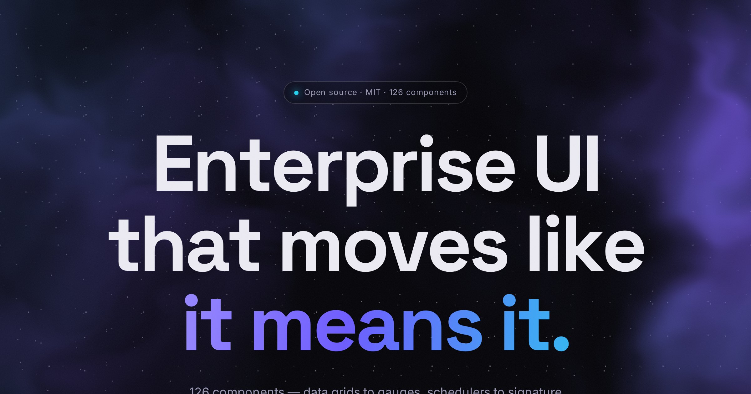
The hero of this page β€” an aurora-borealis backdrop as a ~2 kB raw-WebGL shader. No 3D library, DPR-capped, pauses off-screen, still frame under prefers-reduced-motion.
<aurora-nebula color="#6d5cff" color2="#22d3ee" speed="1"></aurora-nebula>

Lens

<aurora-lens> Docs
Move your cursor over the image β€” it liquifies toward the pointer with a chromatic fringe. A real <img> underneath keeps a11y, SEO and no-WebGL environments intact.
<aurora-lens src="/hero.jpg" alt="…" strength="1"></aurora-lens>

Spotlight

<aurora-spotlight> Docs
Cursor-tracking interior glow and a 1px border beam β€” the feature cards on this page are this component.
Move your cursor over me The glow and the border beam follow it.
<aurora-spotlight class="card">
  Your content
</aurora-spotlight>

Border beam

<aurora-beam> Docs
A luminous beam endlessly travelling the card's edge β€” no cursor required.
Always in motion.
<aurora-beam speed="4">
  <div class="card">Always in motion.</div>
</aurora-beam>

3D scene

<aurora-scene> Docs
Lives on the aurora/three entry β€” this card lazy-loads Three.js as it scrolls into view, exactly like your app would.
loading three.js…
import '@lasitospt/aurora/three' // opt-in entry

<aurora-scene color="#6d5cff" speed="1.2"></aurora-scene>

Particles

<aurora-particles> Docs
A drifting GPU particle field with additive glow and pointer parallax, colored along a two-tone gradient. Also on the aurora/three entry.
loading three.js…
<aurora-particles count="2200" color="#6d5cff" color2="#22d3ee">
</aurora-particles>

Wave

<aurora-wave> Docs
A wireframe ocean β€” travelling sine waves across a displaced plane, viewed from a low angle. On the aurora/three entry.
loading three.js…
<aurora-wave color="#6d5cff" amplitude="0.4"></aurora-wave>